Most catering websites look the same. A hero image of food. A short services list. A contact form buried at the bottom. Nothing that actually helps a buyer decide.
The best catering websites do something different. They answer the questions buyers are already carrying when they arrive. They remove friction before the first conversation happens. And they communicate reliability as clearly as they communicate food.
This is a breakdown of catering websites that get it right, spanning dedicated catering companies and restaurants that have built strong catering web presences. For each one, the question is the same: what specifically makes this website work, and what can a restaurant owner take away from it.
What makes a catering website stand out?
A catering website stands out when it serves the buyer, not the brand. The person arriving is almost always solving a problem under some kind of pressure. A corporate lunch for tomorrow. An event next week. A recurring office order that needs a reliable vendor. The website that answers their questions fastest and removes the most uncertainty wins.
The best catering websites share a few consistent traits. They load fast and work on mobile. They make menus, minimums, and ordering paths easy to find. They show real food photography, not stock images. And they give buyers a clear, low-friction way to take the next step. Every other feature is secondary to those.
1. Chipotle (catering.chipotle.com)

Chipotle runs a dedicated catering subdomain entirely separate from its main restaurant site. That separation is intentional. A catering buyer has different needs than a dine-in customer, and Chipotle does not make them scroll past a full restaurant experience to find what they need.
What makes it unique: The catering site leads immediately with format options, per-person pricing, and group size ranges. A buyer planning a 20-person office lunch can get a clear cost estimate in under a minute without talking to anyone. There are no ambiguous package names. Just clear formats: Burritos by the Box, Build Your Own Spread, and Popular Builds, each with transparent pricing starting from around $8.75 per person.
The ordering flow is fully digital. A buyer can select their format, customize proteins and sides, choose a pickup or delivery time, and check out without a phone call. For corporate buyers placing regular lunch orders, that frictionless process is a strong reason to keep coming back.
The lesson for restaurant owners: A dedicated catering page or subdomain that treats catering as its own product, with its own navigation, pricing, and ordering flow, converts significantly better than a catering section buried inside a restaurant menu.
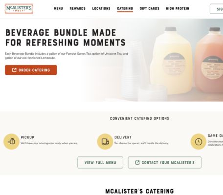
2. McAlister's Deli (mcalistersdeli.com/catering)

McAlister's Deli caters to the corporate office market and has built its catering website around that buyer specifically. The site reflects the brand's positioning around hospitality and handcrafted food without overcomplicating the ordering experience.
What makes it unique: McAlister's leads with format variety that maps directly to common office scenarios. Sandwich trays, box lunches, hot bars, breakfast options, and salads each have their own clear presentation. A buyer organizing a training day can find a full-day catering solution across breakfast and lunch without leaving the page.
The site also leans into the brand's well-known product, the Famous Sweet Tea, as part of the catering offering. For repeat corporate clients, that kind of signature item builds brand association and gives the catering order a recognizable identity. It is a small detail that creates a stronger recall than a generic beverage option would.
The lesson for restaurant owners: If your restaurant has a signature item, make sure it features prominently in your catering presentation. It reinforces your identity and gives buyers something to anchor their recommendation on when they are pitching the order internally.
3. Proof of the Pudding (proofpudding.com)

Proof of the Pudding is an Atlanta-based catering company that has operated for over 40 years. Their client list includes Coca-Cola, the Carter Presidential Library, Georgia Tech, Duke University, and the PGA Tour. Their website carries that weight without being heavy.
What makes it unique: The homepage contains under 600 words. For a caterer operating across 18 states, serving convention centers, stadium events, corporate functions, and universities, that restraint is remarkable. Every service is reachable in one click. The site does not make you work for the information.
The venue partnership section is particularly effective. Proof lists the specific venues where they are the exclusive or preferred caterer, which signals both scale and institutional trust. For a corporate buyer evaluating catering for a major event, that kind of credentialing is more persuasive than any marketing copy.
The lesson for restaurant owners: Clarity converts faster than completeness. Buyers are scanning, not reading. Put your most credibility-building information where it can be found immediately, then get out of the way.
4. Ridgewells Catering (ridgewells.com)

Ridgewells has catered in Washington D.C. for over 95 years. Corporate events, government functions, major sporting events, and high-profile weddings.
What makes it unique: Ridgewells uses restraint as a positioning signal. Clean design, minimal text, and exceptional photography communicate a level of professionalism that does not need explaining. The site never tries to describe the food in adjectives. It shows the food, trusts the photography to do the selling, and keeps the navigation simple.
Legacy is also handled well. 95 years in business is not buried in an about page. It is woven throughout the site as a trust anchor. In corporate catering especially, longevity is one of the strongest signals a vendor can project.
The lesson for restaurant owners: Good photography does more selling than good copywriting in catering. Invest in real event photography before spending on copy optimization. Let the work be visible before the words are read.
5. 24 Carrots Catering and Events (24carrots.com)
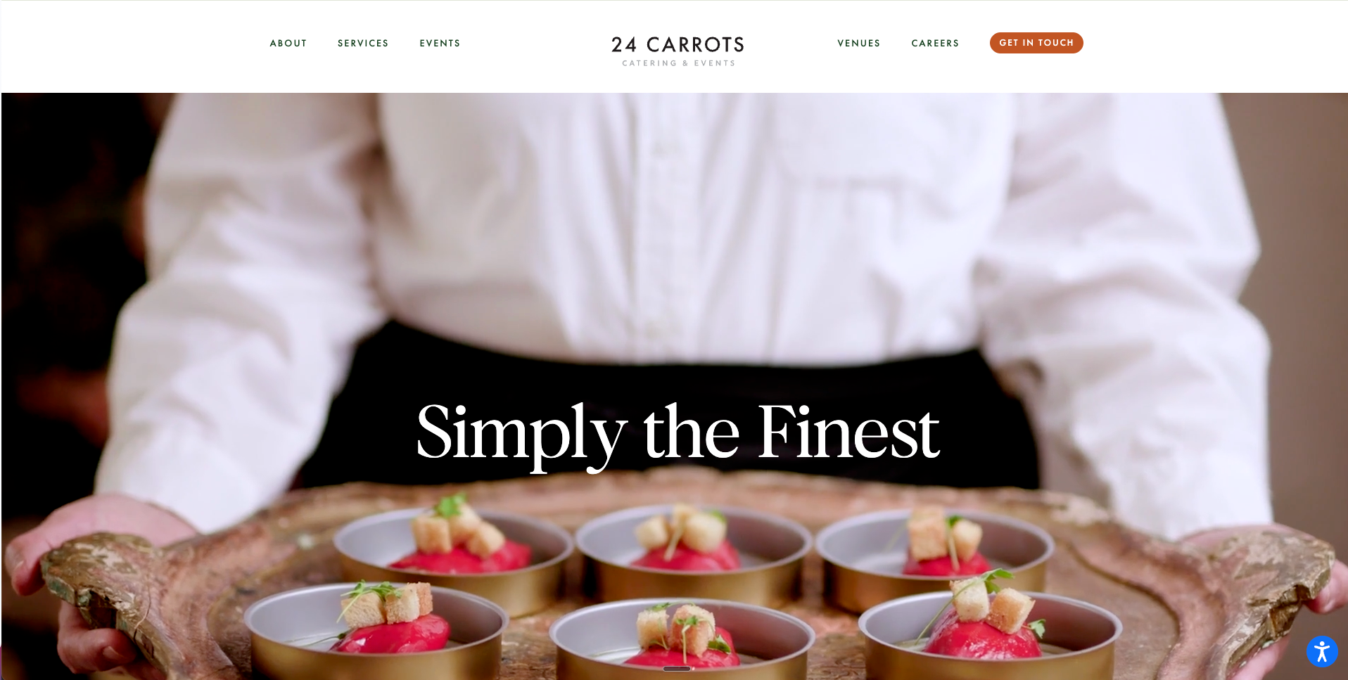
What makes it unique: White space. The site uses generous spacing and a restrained layout that makes every visual feel intentional. Rather than filling the page with features and service descriptions, 24 Carrots leads with food photography and brand personality. The result feels more like a premium editorial site than a service business.
The team page is worth specific attention. Catering buyers are trusting people as much as food. 24 Carrots introduces the team early in the browsing experience, which builds a different kind of trust than a service page can create. For corporate and event buyers choosing between comparable vendors, a sense of who they are working with often tips the decision.
The lesson for restaurant owners: Visual breathing room signals premium positioning. Resisting the urge to fill every section is a design choice that communicates discipline, and buyers read that as a signal about how the operation itself is run.
6. The Catered Affair (thecateredaffair.com)

The Catered Affair is a Boston-based catering company serving corporate and social events across the Northeast. Their website is frequently cited for its effective use of video, which is one of the most underused formats in catering.
What makes it unique: The homepage opens with a full-screen header video rather than a static image. This is not decorative. Video communicates in the first ten seconds what photographs and copy take much longer to establish. The food looks real. The events look real. The scale is immediately visible. For buyers evaluating a caterer before a significant event, that visual confidence reduces perceived risk faster than any other format.
The Catered Affair also routes visitors by event type early in the navigation. Corporate and wedding buyers are taken to separate pages, each built around their specific concerns. A corporate buyer does not want to wade through wedding content to find information about office catering. Segmenting by buyer type from the beginning makes each visitor feel like the site was built specifically for them.
The lesson for restaurant owners: If your catering operation handles multiple buyer types, route them separately. A corporate landing page and a social events page will each convert better than a single generic catering page that tries to serve everyone at once.
What every strong catering website has in common
Across all 6 examples, the same patterns repeat. Fast load times. Real photography. Navigation that routes buyers to relevant information without effort. Visible social proof. An inquiry or ordering path that does not require the buyer to work for it.
None of these websites are complicated. The work is in the execution: the photography, the routing, the logistics transparency, the response speed behind the form. These are the things that turn a catering website from a brochure into a conversion tool.
For restaurant owners building or improving a catering web presence, the starting point is straightforward. Think like the buyer. What do they need to see to feel confident booking you? Put that on the front page. Remove everything that does not serve that purpose.
A great catering website gets the first inquiry. What happens after that, the follow-up, the execution, the loyalty program that gives buyers a reason to reorder directly, determines whether that inquiry becomes a long-term account.
Frequently Asked Questions
What should a catering website include?
At minimum: clear menus with pricing guidance, delivery zones and minimums, real food photography, visible contact information, and a simple inquiry or ordering path. Testimonials, setup logistics, and FAQ content significantly improve conversion for first-time buyers doing research.
Do restaurants need a separate catering website or page?
A dedicated catering page or subdomain consistently converts better than a catering section buried within a restaurant menu. Catering buyers have different needs and different questions than dine-in customers. Separating the experience, even slightly, signals that catering is taken seriously as its own service.
How important is photography on a catering website?
It is one of the most important conversion factors. Catering buyers are choosing food for other people and need visual confidence before committing. Real event photography builds that confidence faster than any copy. Stock images undermine trust because experienced buyers recognize them immediately.
What makes a catering website work well for corporate buyers?
Transparency on pricing, minimums, lead times, delivery logistics, and dietary options. Corporate buyers are placing orders on behalf of others and need to feel confident nothing will go wrong. Clear logistics information, visible proof of past corporate events, and a fast response process reduce anxiety and increase conversion.
Should a catering website include video?
Yes, when the production quality is strong. A short video on the homepage communicates scale, food quality, and operational professionalism faster than any static content. Even a 30-second clip from a real event can significantly improve buyer confidence and inquiry rates.
How often should a catering website be updated?
Menus and pricing should reflect current offerings at all times. Outdated information creates friction and erodes trust with buyers who need accurate details to make decisions. Photography should be refreshed whenever a new event produces strong visual content worth adding.

.png)


